Hot this month! is a dynamic media brand designed to transform the reading experience into an iconic cultural appointment.
The project is a Substack-born platform that merges curated content with a bold & pop elevated visual language. Tailored primarily for a millennial and female audience, it puts the creators (Maria Elena and Damiano) at the center of the narrative, turning them into the recognizable protagonists of their own communication.
By bridging engaging writing with a high-impact aesthetic, Hot this month! seamlessly connects across Instagram and future podcast platforms, establishing deep authority for its readers and strong value for potential partners.
Work:
Development of the brand identity, including primary logo, icon, and extended logo design, typography selection, and color palette definition. Creation of custom headers for content categories and layout design for the Substack website.
Development of the brand identity, including primary logo, icon, and extended logo design, typography selection, and color palette definition. Creation of custom headers for content categories and layout design for the Substack website.

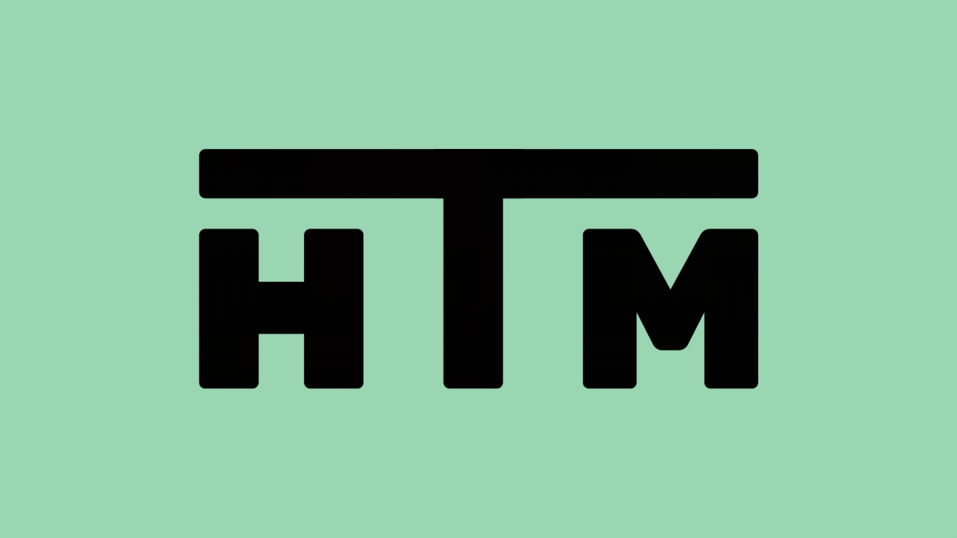
Primary Logo
Our primary logo is an intentional statement of bold authority and contemporary flair. Inspired by the 2000s aesthetic, it serves as a powerful visual anchor for the brand, perfectly balancing a sense of trendy freshness with a professional media presence that speaks directly to a millennial audience.


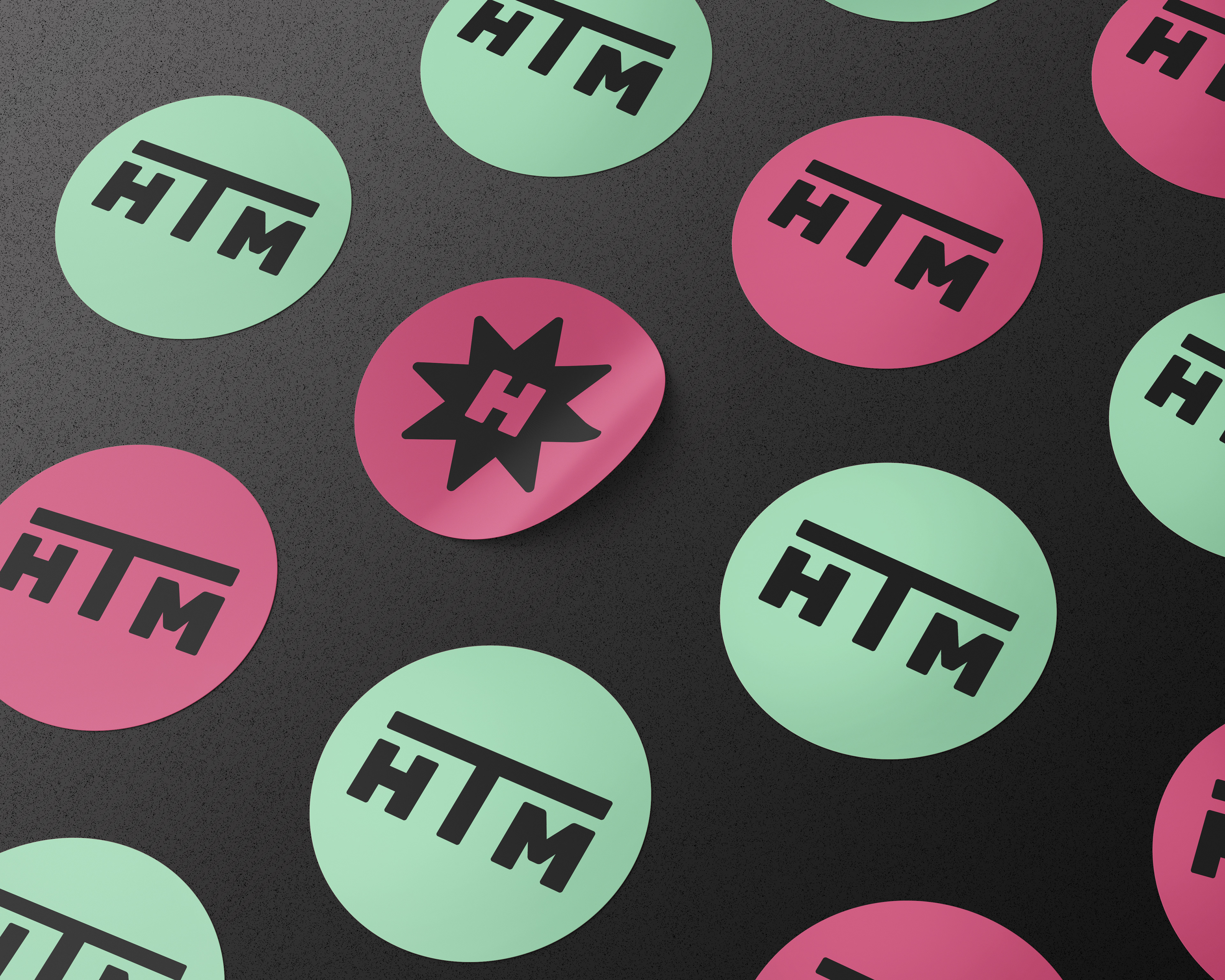
Logo Variations
To guarantee complete visual flexibility across print and digital media, we developed a cohesive system of logo variations designed to maintain maximum impact on any layout. The standalone icon strips down to the essential starburst element, acting as a quick, striking visual stamp for small-scale applications like social media avatars.
For horizontal spaces, we include the sleek "HTM" monogram ensuring the brand identity remains sharp, recognizable, and balanced whether it appears on a mobile screen, a podcast thumbnail, or corporate presentations.


Headers
The custom headers are designed to establish a clear, structured, and identity-driven editorial architecture across the platform. Utilizing the brand's distinct color palette—featuring a vibrant pink paired with deep black layouts—each category title is given an authoritative, heavy typographic treatment.
These headers act as a cohesive visual thread across different topics, instantly transforming every new Substack post into a professional and instantly recognizable piece of branded content.