Getout! is your invitation to rediscover the worth of real-life experiences.
It is a platform designed to break screens and connect people to authentic life. We leverage technology to drive you toward living genuine adventures. Through exclusive and engaging challenges, we transform the online experience into real-world action. Getout! aims to create a world where technology connects, rather than isolates.
Work:
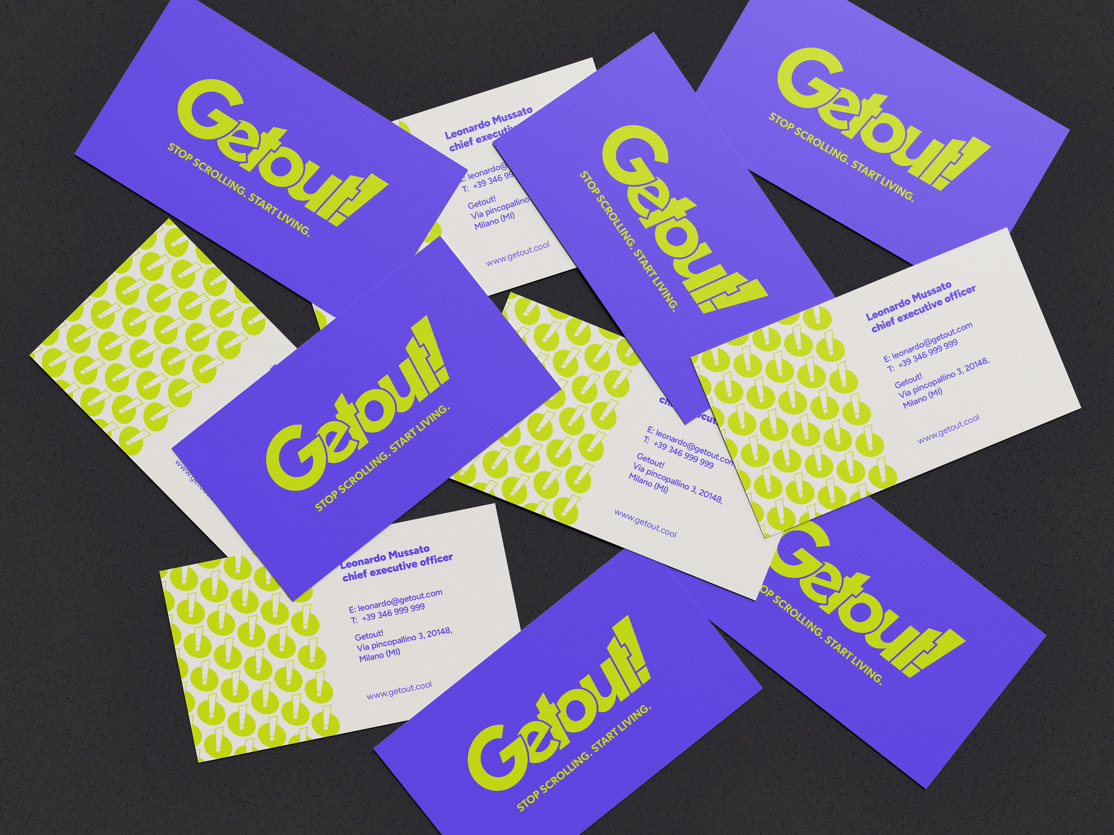
Development of the brand identity, including logo design, typography selection, and color palette definition. Creation of patterns for both print and digital media, and layout design for gadgets and business cards.
Development of the brand identity, including logo design, typography selection, and color palette definition. Creation of patterns for both print and digital media, and layout design for gadgets and business cards.
Services:
Brand Strategy
Brand Identity
Brand Strategy
Brand Identity
Client:
Italians Code it Better (2025)
Italians Code it Better (2025)

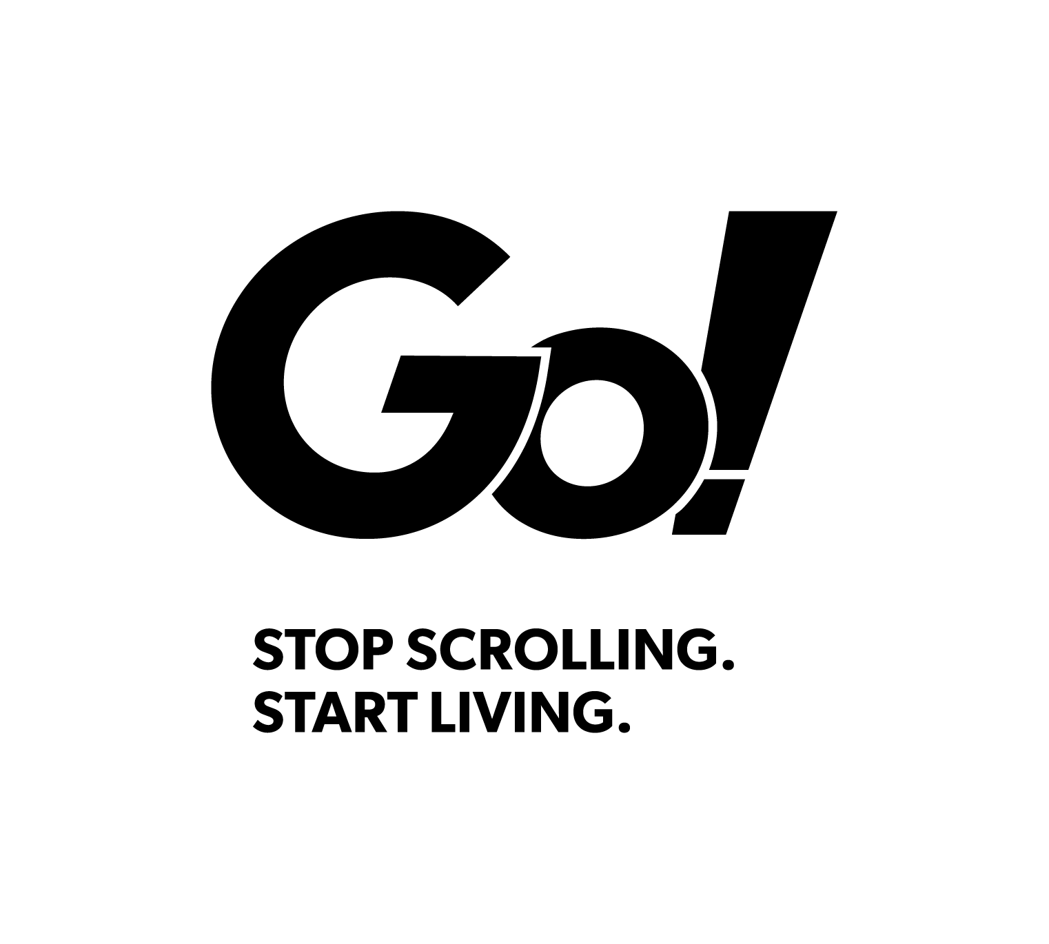
Primary Logo
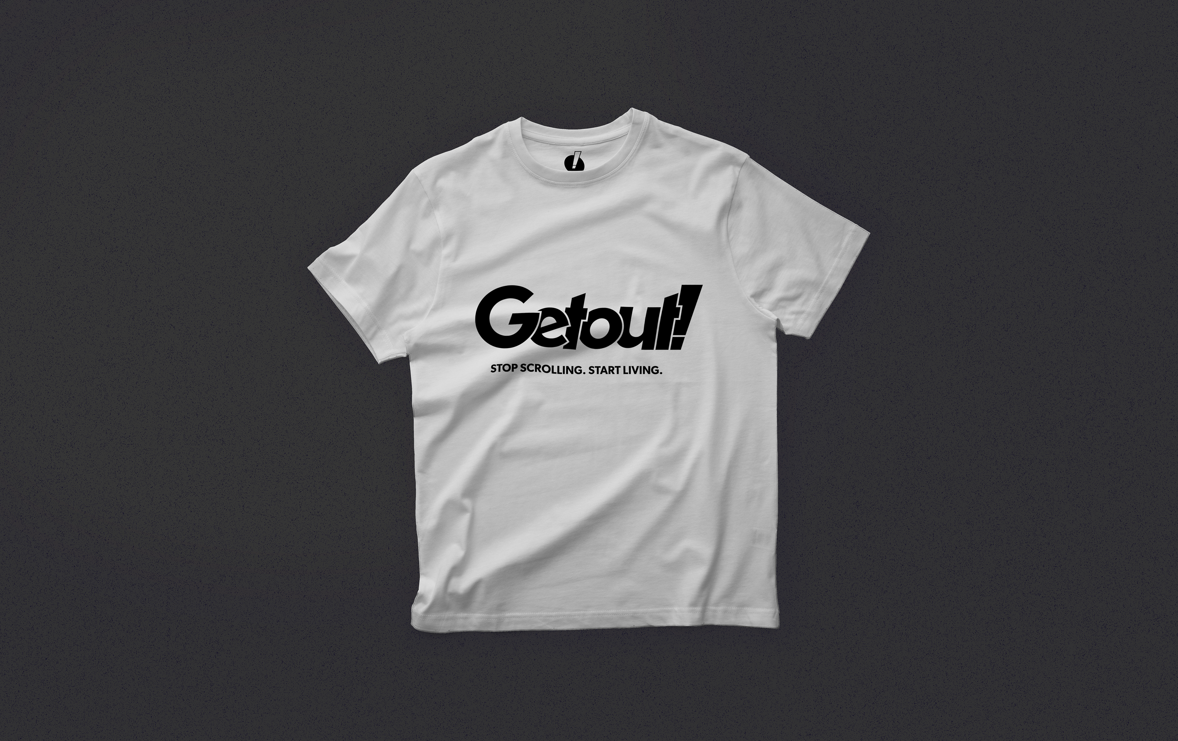
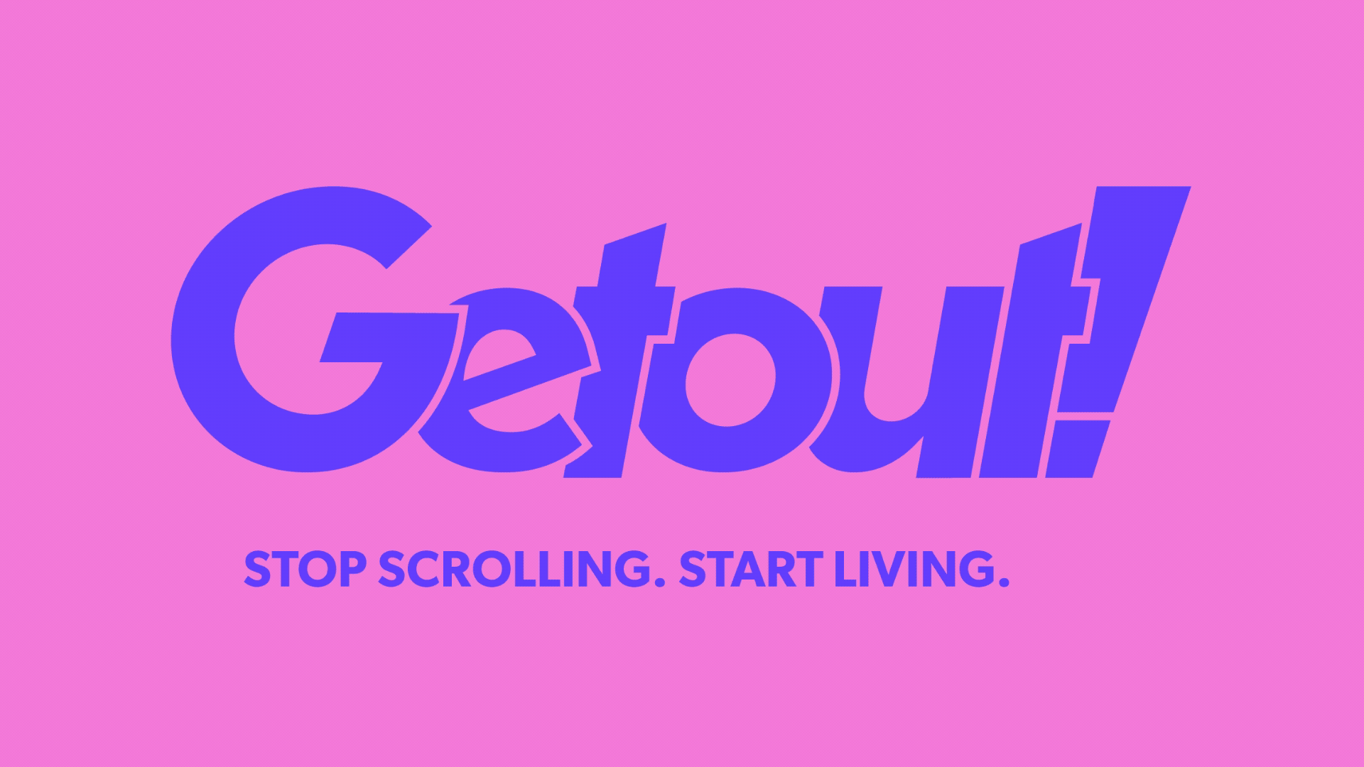
Our logo is an impulse to break the mold and step out of conformism. Its asymmetrical composition suggests movement and rebellion, evoking the idea of cards displayed on a table that mirror the app's interface.
Inspired by the desire to interrupt monotony and encourage interaction, the design embodies Getout!'s invitation to live experiences that take you out of the ordinary and connect you to the real world with grit and originality.
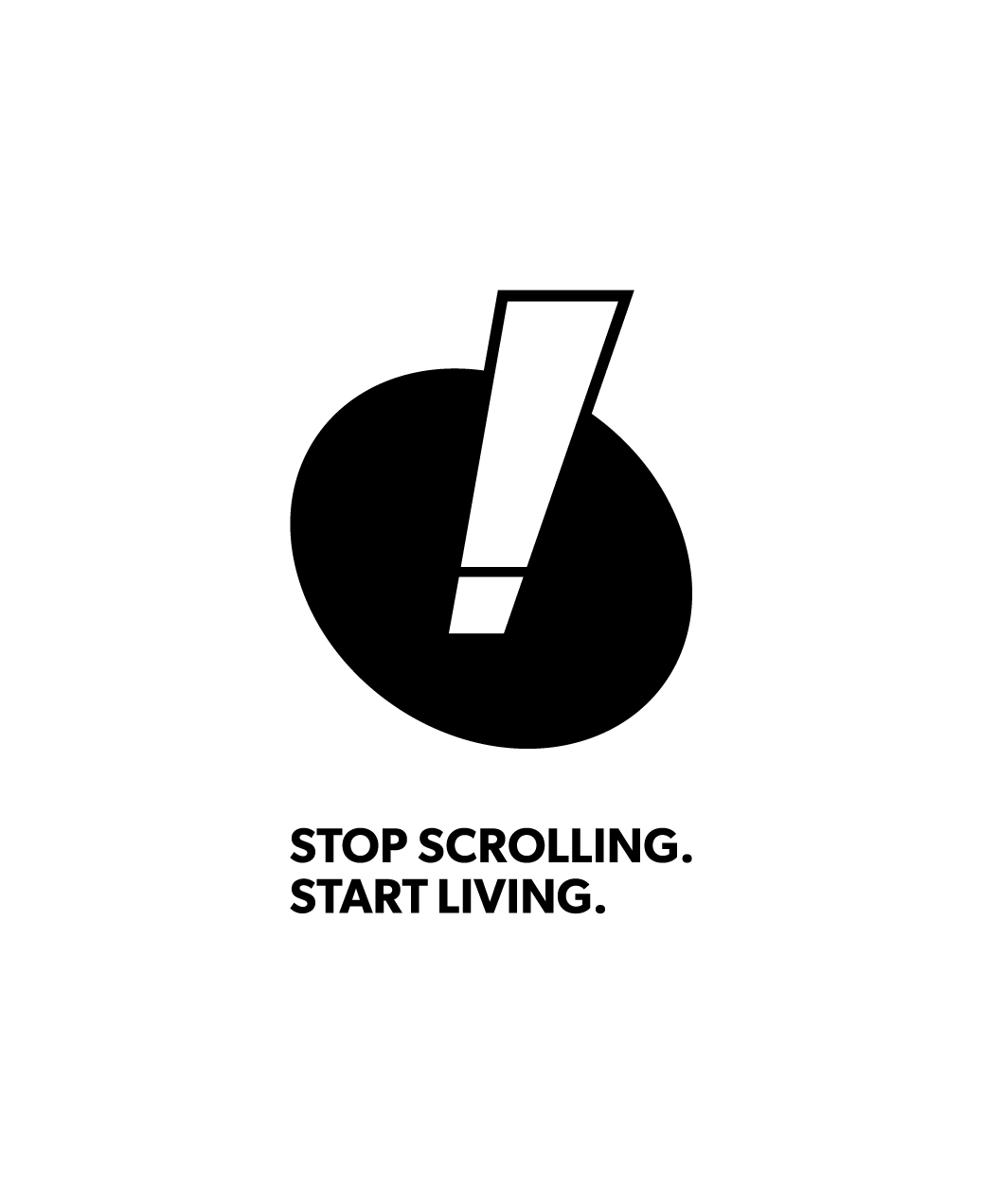
Logo Variations
In addition to the primary logo, we utilize two strategic variations for maximum versatility and impact, ensuring the Getout! identity is always clear and incisive, wherever it appears.
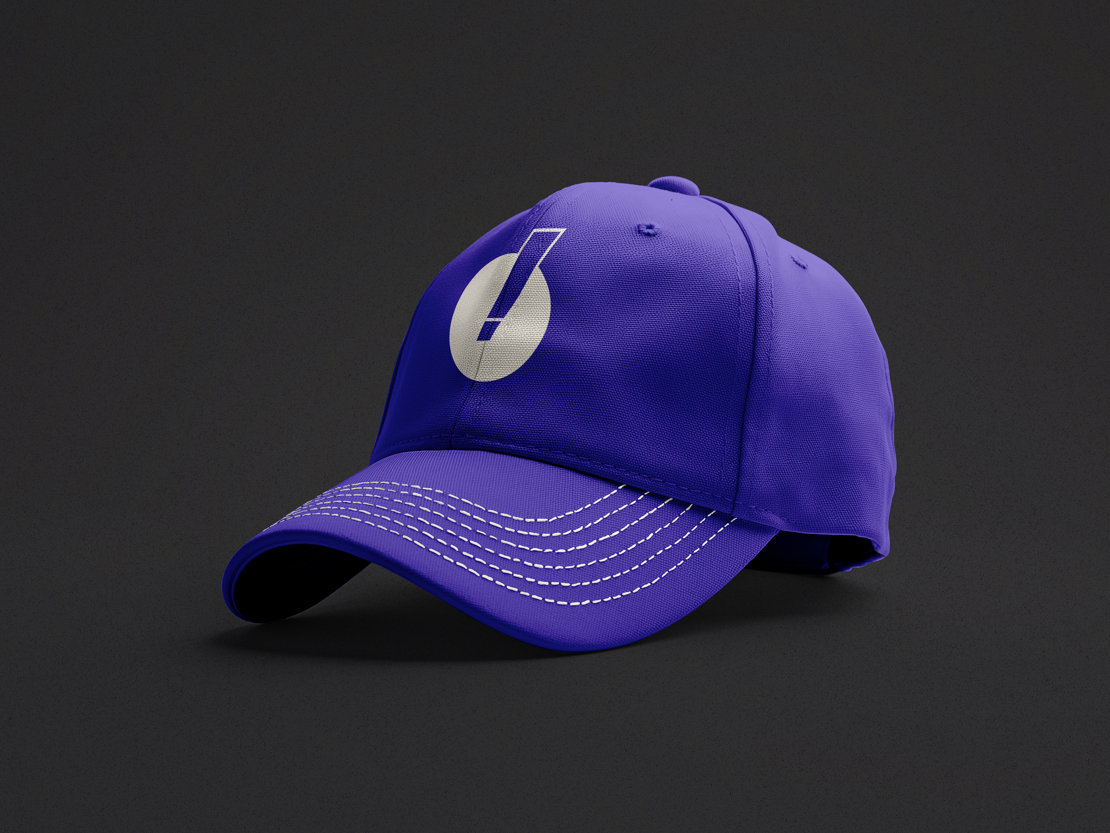
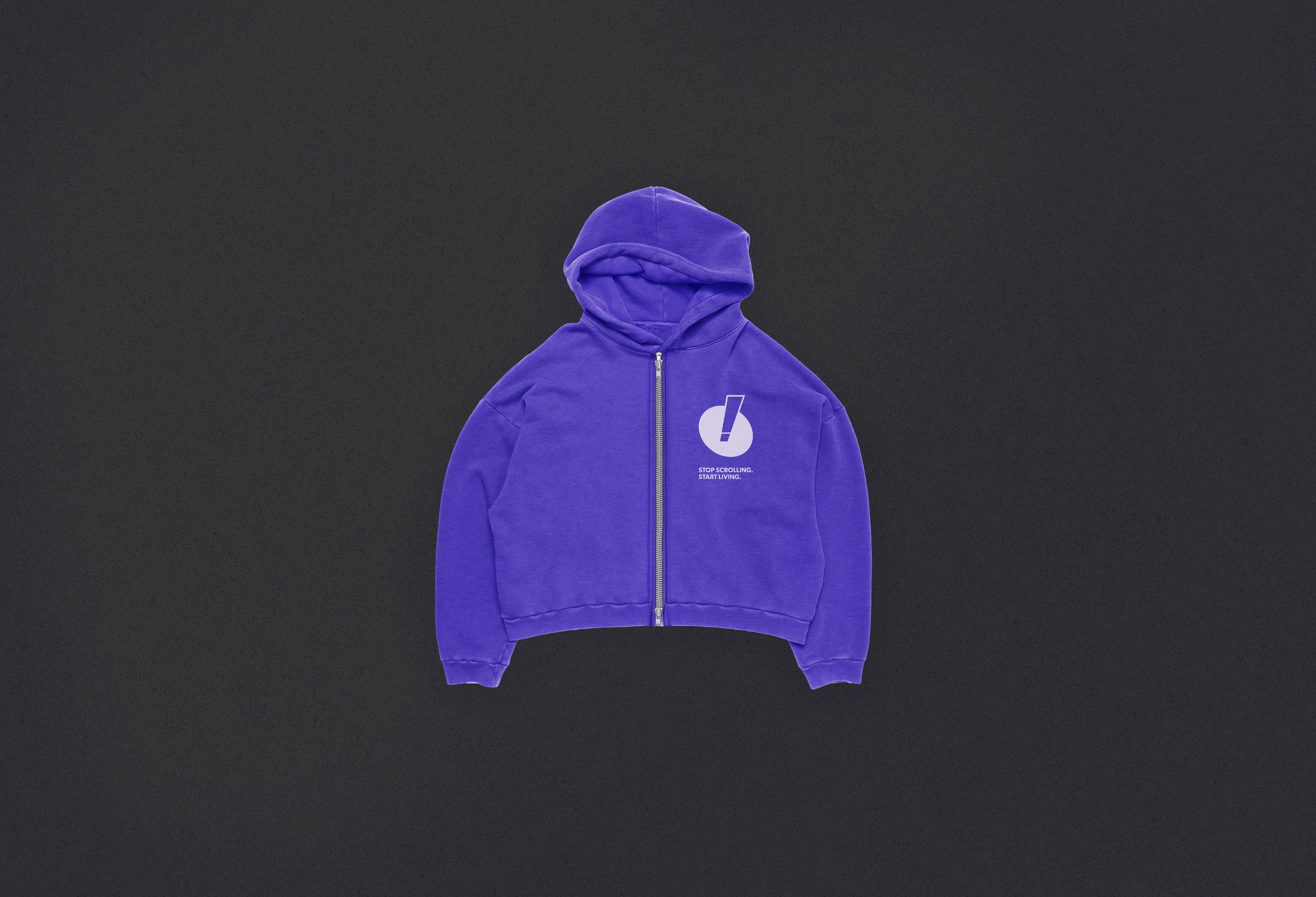
Our icon is an exclamation mark dynamically breaking out of a circle, embodying the urgency to "get out" of monotony and the audacity to break the mold, prompting immediate action. As a logotype synthesis, we maintain the brand's drive for action intact, using a direct and incisive expression that corresponds to the brand's initials.